Dienstag, 29. September 2020

10 Truly Wireless Headsets Compared

Intro - skip for just the facts

I ignored the True Wireless Earbuds for some years, the limitations on the first generations were just too much of a blocker for me. But things move on and the newer generation is way better than what was available a few years ago.

This is a shootout especially with sports in mind. When I want high quality audio, I use my Sony WH-1000M3. And when travelling, I rely on my Sony WI-1000X with their >12hrs of battery live and their excellent ANC. But both aren’t sports headphones for running. As I mostly listen to audio books and podcasts when running, I added to them a pair of Sony WI-C300, which I got as a special offer for 15,- Euros. Just as I write this, this feels a little Sony biased, but over the years I had a variety of headphones from all kinds of brands. 

My main issue with the WI-C300’s is the cable between the earsets. It always gets entangled with my shirt, especially when turning my head eg. before switching lane sides. Also, they have no key to skip back and forth in my book or playlist. So I have to move on to a pair of true wireless.

Methology

I restrict my selection to brands I mostly knew, I am not interested in Chinese no-name headphones from eBay though I might miss something interesting. Also I exclude brands from which I know, that their sound is not my cup of tea. When I listen to music, it is analogue music from Classic Rock to Jazz. So if you are a mostly electronic music listener, my findings on the sound might not be relevant to you. I prefer a natural sound, so Bose and Beats don’t make it onto my list. With the remaining brands, I went through the manufacturers sites and tons of review from others.

I made a Sheet in LibreOffice with all headsets that sound interesting enough for me and pulled all features that were relevant to me from the vendors websites. Starting with the basics like price (Sep. 20 in Europe), Bluetooth standard, supported CoDecs, battery runtime, IP rating, and weight, I added the special features that interested me: 

  • Do they have an ambient sound feature and an easy way to access it? I love this function on my WH-1000M3.
  • Does it they have fast charging? A feature that is only missing on older models these days
  • ANC is not my primary requirement for sports. When running in the public I would always turn it of, but it is a nice to have feature. Only the Sony’s offer ANC, but Jabra also announced it.
  • Do they come with an app, eg. for EQ settings, controls customization or software updates?
  • Which controls do they offer, like volume, skip etc. (and which are missing)?
  • Do they have some extras, that do not fit elsewhere?

You can download my sheet and adjust it to your requirements. After all, four headsets made it onto my shortlist and I ordered them for my personal testing. And BTW, I payed for all with my own money, I have no deal with any manufacturer.

For the sound check, they all have to compare to my excellent Sony WI-1000X for reference, as well as to each other.

I don’t judge call quality. They are all good enough in case of emergency, but I would not use any of these for a conf call with a customer.

Runners up

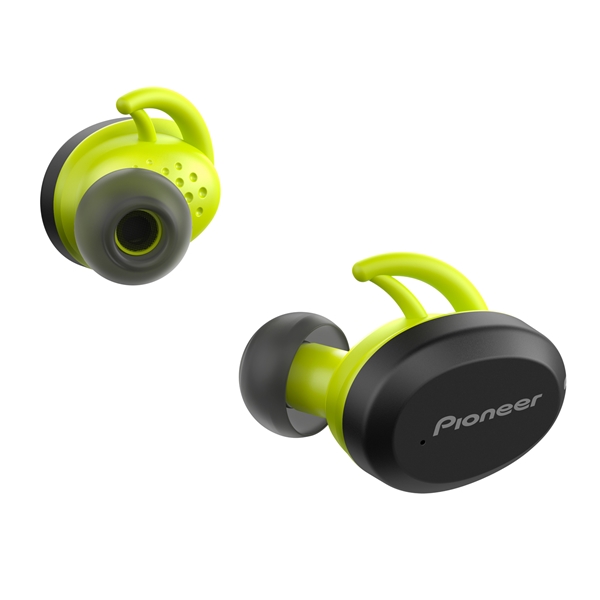
Pioneer SE-E9TW-Y

 
The Pioneers looked like the middle ground, both price- and feature-wise. They offer a higher IP rating than most and support AAC for better audio quality. But they are the heaviest on my list, more than double the weight of the lightest though they only offer below average battery runtime.

They cost about twice as much as the cheapest on my list without offering significant more value spec-wise. And they cannot even control the volume from the headset, so when running you need to get your phone out of your pocket to adjust the volume.

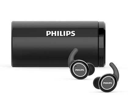
Philips TAST702BK

The Philips cost nearly as much as the speakers from the shortlist, but don’t offer much that judges the price. They are on the heavier side, offer only average IP rating and like the Pioneers, they cannot be used to adjust the volume. The only feature to set them apart from the rest of the bunch is an UV-cleaning feature in the charging box. That would be a nice extra feature for a set of headphones that already have everything. But I see no sense in offering this instead of necessary features.

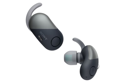
Sony WF-SP700N

This is an older model that only supports Bluetooth 4.1 resulting in bad battery life of only 3 hrs. Also they have only an IPX4 rating. Also they have practically no music controls except for Play/Pause. At least they only cost 94,99 Euros and are supported by Sonys Headphones App. But even when you are on short budget, I see no reason to get these until the price will drop significantly. At least, as these are Sonys, so I would expect them to sound balanced.

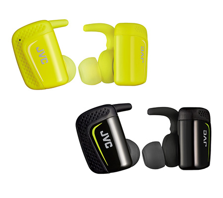
JVC HA-ET90BT-E

This is also an older model. I could not find any information on the supported Bluetooth standard, but considering it’s short battery runtime and age, I would expect that it is BT 4.x. At least it has an IPX5 rating and is one of the lighter headsets. Also it can control volume, though skipping back and forth needs to be done on the phone. And it comes with an app for extended controls, that also has a nice Find-my-Earbud feature, making it flash and beep to find them if you drop them. That is a great idea and I have no clue, why the newer and more expensive JVC models come without it. At least, if you are short on budget, this looks like a better offering to me than the Sony WF-SP700N. 

Shortlist

Jabra Elite Active 75t

Jabra were the first to deliver, so I tested them first. I ordered them directly from their site, as they offered a 10% discount when registering for their newsletter. This is btw the only European manufacturer in this test, the rest is from Japan.

Specs and Price

The Jabras have a 7,5h battery runtime, solid but not classleading. On the other side, these are the smallest and lightest on the shortlist. Personally, I would not trade a longer battery life for a larger and heavier body. Spec-wise, their only real weakness is the price at around 200,- Euros, but with the discount the at least catch up to 2nd most expensive, which are the JVC HA-AE5T. An overall excellent package, but with the highest price, no ANC and only average runtime on the shortlist. But Jabra announced to bring ANC via software update in October ‘20, so they will probably catch up to the Sonys.

7,5/10

Haptics and build

The first impression of the Jabra is excellent. They come in a small charging box, the material of both feels premium. The buttons on both earpieces are easy to use, so they do not need to be pushed hard inside the ear for operation. The Active Elite 75t have the highest IP rating on the shortlist, which should help longevity. So for build quality, I have nothing to complain with, giving them 10/10 points. Of course, even with the 10% discount, they should offer premium haptics for that price. 

10/10

Operation

The 75t come with an app with a variety of settings and a manual. For the keys, every function can be remapped to your like. I could set up my favorite settings within minutes. The app itself is well designed and functional. I would say that this is typically scandinavian design, though I have no clue where it is developed. You can go through a hearing test to let the headphones better match your hearing capabilities. And you can also adjust the EQ afterwards and save some personal sound profiles. 

Additional, the Jabras come with some features, I found on no other brand. With sidetone, you can hear your own voice during phone calls. Unfortunately I could not make this feature work. And with Multi Use, you can pair it with two devices and use both to take calls. And they have a noise generator, to play white noise or nature sounds into your ears, when you just want something to help you blocking outside noise without music. Overall, the operation of the Jabras is no less than excellent.

The only drawback is, that the 75t only operate in a master/slave setup. So you can use the right earbud alone, but not the left one.

9/10

Comfort

The 75t fit easy into my ears and did not fall our or got loose at any time. They don’t use any additional rubber arms to sit tight in your ears. As they are so small and light, there is less leverage force that needs to be compensated compared to other earbuds that reach out further out of the ear. So no complaints on the comfort side.

10/10

Sound

Until now, it almost looked like an easy win for the Jabra. So at my first sound check I was badly surprised. The sound was significant behind what I expected, especially in that price range. So I did the sound check to let the earbuds adjust to my hearing capabilities and took some time in the EQ to find a sound, that is more what I would expect. And of course, the sound got better, but it was still way behind my WI-1000X. So I compared it to my cheap WI-300C to have a lower reference point. Of course, in music the 75t sounded better than the WI-300C and they are also a little louder. But the difference wasn’t so great, especially when looking at the price tag. To make this clear: the Jabras are closer to my 15,- Euro WI-300C, than to my WI-1000X. It became worse when testing with a podcast. No matter how many settings I tried, the Jabras sounded not as natural als my WI-300C.

The best way to describe what I heard was digital. As if the sound had a too low bit rate and has been overprocessed. Like some frequencies in bass and treble were pushed too hard and the waveform have been modified to steeper flanks. Jabra also has a Bass Boost feature. Pushed to the max, the Jabra’s bass sounds deeper and harder than the Sony’s.

And to make this clear: for fairness, I switched the WI-1000X from Apt-X  down to SBC to get the Bluetooth transfer out of the equation. So Leo Laporte from This week in tech sounded natural through my old WI-300C, but like through a low bandwidth phone connection on the Jabras. And for classic rock with analog instruments like Wild Dogs from Tommy Bolin, it also sound a little like hearing music through a phone. Also I tried Snake Eater performed by Video Game Orchestra featuring Ingrid Gerdes from YouTube. Though it is highly compressed, it can sound great on a good pair of headphones. On the Jabras, it sounded like some frequencies were missing. The rhythm guitar is hardly to notice. Maybe for digital produced music, this is no problem, just because it is digital anyways. All the reviews I saw tested with digital music, so maybe the Jabras are better suited for that kind. So I tried some songs that I thought they migth be better suited the Jabras, for example I tried some Depeche Mode songs or Funky Cold Medina. But I did not get better. So I read the review on Rtings.com and compared the 75t to some simlar Sony headsets and their measurements proof what I hear.

6/10

Conclusion

I have always recognized Jabra as a brand for professional business headsets, and not for fidelity audio. I have really been surprised after the the many positive reviews on YouTube. And after my review I think that this also reflects in my results. The Jabras excel in every professional feature, from build-quality to operation, comfort and usability. But soundwise, they are better, but not so much compared to my cheap WI-300C for 12x the price.

43,5/50

Sony WF-SP800N

The Sonys came in 2nd. As I generally like the balanced sound of these, my expectations were high.

Specs and Price

The WF-SP800N are the kings in battery life. With 13 hrs without ANC and still 9 hrs with ANC enabled. If you need more battery life, you will have to look in the next bigger classe like the Sony WI-1000X. But this comes at a price, the WF-SP800N are also the heaviest in the field.

It’s price of 161,54 is slightly above average. But apart from price and weight, the WF-SP800N has no real weakness though a higher IP rating would be desirable.

8/10

Haptics and build

The first impression of the WF-SP800N is very good, though the Jabras feel slightly more premium. The charging box, the is quite massive and is rounded on the bottom, so it cannot stand. The earbuds have touch buttons, so they have no rattling mechanics. So there are no complaints about the build, though the coated material of the Jabras feel even slightly better in my hands.

9/10

Operation

The WF-SP800N also come with an app, that is the same as for other Sony wireless headsets. So it gives full EQ acces with individual sound profiles, effect filters and also Sonys Clear Bass feature is available though I cannot hear any difference with or without it. On my WI-1000X, Clear Bass makes a big difference.

Also in the app, the keys can be remapped. But the Sonys are less configurable than the Jabras. In the Jabra App, you can assign every key and pressing pattern to any function you like. For the Sonys, you can only choose bundles of key patterns and assign these to the buttons. Better than nothing, but not optimal. Putting Volume to the left and Play/Pause/Skip to the right, I cannot use Ambient Sound, though there are unused key press patterns. On the Jabras, I could easily set this up to my like.

Apart from that the app comes with some more settings and a manuals, some of the manual entries are just links and they need to be downloaded. Overall, the Sony App is very good, but lacks the elegance and easy of the Jabra App.

Both earbuds connect directly to the device, so you can choose to use any of them alone. They also come with ANC, but this is no comparison to their high end headphones like the WH-1000M3. It’s isolation is in the range of the WI-1000X, only that the Ambient Sound feature is less effective. But as they are the only headphone with ANC (until the Jabras will get it with an update), this is definitely a plus.

8/10

Comfort

The WF-SP800N are not ideal for my ears. With the medium earbuds and the small rubber fingers called arc supporters, they felt a little loose though they never felt out. With the larger earbuds and arcs, they fitted sturdy into my ears, but putted a little too much pressure to my ears, so they felt a litte more unconfortable than the Jabras. 

8/10

Sound

Using a new pair of Sony headphones is like coming home again for me. I really like their balanced sound and same is for the WF-SP800N. Comparing them to the WI-1000X, it is obvious that they are from the same family, though the WI-1000X sound fuller with more bass. And for my cheap-headphones reference WI-C300, the WF-SP800N sound significant better with more bass.

The bass is not as hard as from the Jabras, but they sound fuller and more balanced. Though they cannot keep up with the WI-1000X, for true wireless headsets they sound very good. I would love to compare them to the Sennheisers, but these are out of scope as they only offer cabled wireless headsets for sports.

10/10

Conclusion

The Sony WF-SP800N are somewhat like the opposite of the Jabra 75t. The Jabras are perfect in nearly every aspect except for the sound. Score-wise it is 43,5 compared to 43 in favor of the Jabras, but it will be a 44/43 win when Jabra delivers the ANC via update.

The WF-SP800N have imperfections in nearly every section. I cannot 100% configure the controls to what I want, the box is bulky, the earpieces are heavier and do not fit as perfect as the Jabras. It is not, that they are bad in these aspects. They just lack the last bit of perfection that the Jabras offer. But they just sound so good, that I am willing to look over these little imperfections.

43/60

JVC HA-ET45T

The HA-ET45T are a bit out of contest here, as they only cost about the third of the other contendors. So I don’t consider them to be on par with the rest of the shortlist. But I am interested how close they can get and maybe they are good enough, so I can save some money. 

Specs and Price

These JVC’s have a 4h battery runtime, which is the weakest in this group. Of course, here is where JVC cutted corners to reach that price tag of 69,95 Euros. On the other hand, this is long enough for any of my workouts and even two of them. Though for an every day’s headset, a longer battery runtime would be desirable, for a workout headset I would accept that shorter runtime to save 2/3 of the money.

Surprisingly, for the rest of the specs, the HA-ET45T are mostly on par with the rest of the field. Their weight is slightly above average, but they come with both, ear fins and hooks. They support Bluetooth 5 and have an IP55 rating. They don’t have advanced features like ANC, Ambient Sound or an app, but that is OK for this price. But all functions can be operated directly from the headset. Overall they offer exceptional value for the money

7/10

Haptics and build

The HA-ET45T make a very good first impression, better than the price tag might assume. They cannot keep up with the rest of the shortlist, but these cost nearly three times as much and they don’t feel three times better.

The rubber covered buttons feel a little cheaper in comparison and so do the rubber fins and hooks. With all that rubber, they cannot keep up with the simple elegance of the Jabras. But that rubber is there for a reason, the HA-ET45T are the most unlikely ones to drop while running.

And the charging box is the biggest, but this is because the earpieces fit into it without removing the ear hooks.

8/10

Operation

There is not much to say about the operation of the HA-ET45T. Everything can be operated with the two buttons on both sides and there is nothing to configure. But having Volume, Play/Pause/Skip directly on the headphones is a great plus, that many contenders, that not made it onto the shortlist, lack.

They also work in primary/secondary mode, so if you only want to use one earpiece, you will have to use the left one.

7/10

Comfort

The HA-ET45T sit comfortable in my ears. A little loose but thanks to the fins and the hooks I never had the feeling that I might loose them. My only complaint is, that the buttons need a strong press which presses the headphones deeper into my ears which feels umconfortable.

7/10

Sound

The HA-ET45T sound surprisingly good. At first try with Reelin’ in the years from Steely Dan, I though wow, these sound as good as the Sonys. But when A/B comparing them it was clear, that they cannot keep up with them, as the HA-ET45T could need more bass. But apart from that, they sound balanced and voices are very clear on audio books.

It is hard to compare their sound to the Jabras. The 75t have more bass and are EQ’ed for a more exciting sound, but often let me think that some sound processing is running. The JVCs are the complete opposite. Their sound is unexciting, but more honest what I personally prefer. But if base heavy electronic music is your thing, than the HA-ET45T may not be the best choice for you.

7/10

Conclusion

The JVC HA-ET45T are the budget friendly option for anyone, who wants these as workout headphones and can live with the weaker bass. The operation can be a bit unconfortable, depending on how sensitive your ears are. Especially, if you are an audio book or podcast listener, these sound very good and natural.

With the earhooks, they are the least likey to drop and because of that, they do not need to fit as tigth into the ears as others. That might be a plus on comfort.

Overall the JVC HA-ET45T are punching above their weight and are a killer offering for that price, as long as you can live with some smaller issues compared to others that costs three times as much. But these are all minor issues. If you are short on budget, just get the HA-ET45T. They cannot beat the pricier options, but are coming close.

36/60

And my Winner is ...

The Jabra Elite Active 75t are the most complete package in my opinon. But I am very sensitive to audio processing. I love live music acoustically or electronicly amplified with little filtering and processing. The Jabras are more for the opposite audience. That does not mean, they are bad, this is just not my cup of tea. During my review, Jabra announced the 85t with bigger speakers. So they will hopefully have more natural bass which means that they could reduce the amount of audio processing if they want to. These could become an interesting option and I will keep an eye on them.

I was close on keeping the JVC. For that price, they are good enough for me and better than my old WI-C300 anyway. But I started to use the truly wireless earpieces for a bit more than just for workouts and then, the HA-ET45T is not the best option. I also wanted to review the higher spec’ed HA-AE5T, which are feature and spec-wise in the league of the other contenders. But they are not available here in Europe now and need a few more weeks to be deliverd. 

My personal choice are the Sony WF-SP800N. They sound best to my ears and have all the features I want. They are not perfect, but also have no show-stoppers for me. And the more I use them and get used to them, the more I like them.

But maybe in half a year, they will have to defeat their title against the Jabra Elite 85t and the JVC HA-AE5T.

Sonntag, 23. August 2020

LG G8S vs. Samsung S10: 2020's last year top models user review


Intro
When looking for a new smartphone, I always recommend to go for last years top models. Last time, the S7 Edge won over the LG G6 for me. This time it is the LG G8S Thinq vs the Samsung Galaxy S10. I skipped the S8 and S9, because the normal size (not +) models did not any significant advatage over my S7 Edge, which has beed updated to Android 8 in the meantime and still got a new security patch this year. And I skipped the G7, as I always preferred the phones with OLED screens.
I am still very satisfied with my S7 Edge, but I wished for a better camera with wide angle and tele lens. And as the G8S now also has an OLED display, I have two of last years champions to choose from.

Overview
The S10 is last years low risk Galaxy update, like the predecessors have been before. The only significant changes were the move to a in place fingerprint sensor and the triple camera, already in the base modell. LG made more changes compared to the G7. Finally, the display technology changed to OLED, it got a depth sensor at the front and triple camera. But in return, LG removed the excellent QuadDAC and the Boom Box Speakers. So lets see how they compare.

Price
This is the easiest part. If you are short on budget, just get the G8S. Watch out for special offers, I got mine for EUR 310,- while the best offer for the S10 that I found is EUR 510,-. So the G8S is only 60% of the price of the S10. Both phones have their pros and cons, but if you need to watch your budget, the differences aren't so big that these would judge nearly double the price.
The G8S, beeing one of LG's last years flagships behind the V50, is now in the lower midrange price region which makes it a bargain.

Rating - G8S: 9 - S10: 6

Software

I did this test in May and June 2020. The S10 is on Android 10 with June 2020 security patches, which is excellent. The G8S came with Android 9 and the latest security patch I got was from March 2020, which is not a good result for a phone from last year. LG has always been weak with patches and it did not get better with the G8S. LG has annouced to roll out Android 10 to the G8S this fall, but at the time of writing at the end auf August 2020, there is no Android 10 on the LG.
Samsung has already announced to deliver an upgrade to Android 11 for the S10, I won't expect that for the G8S. But for today, I can only rate what is available now.
Android 10 is important for a real dark modes, which makes sense to save battery on an OLED device. The G8S has a high contrast mode, which is ugly IMHO. You can download some dark themes for the G8S, but not everything is skinnable so the result is some mixture of dark and light mode. Overall, LG's skin looks very old fashioned as like they cannot say good bye to Android 4. I like Samsungs One UI, it gives the system a fresh look without doing too much.
Samsung comes with it's own voice assistant Bixby, but you can always use Google assistant on both phones. I don't care for both launchers. Both are OK and will do the Job somehow. But I install Nova Laucher on both after a short period of working with the vendord launchers. Overall, both systems come with some nice extra functionality like extra application launcher side menus, location based services etc. Overall, both are very similar in terms of extra features, but LG's sluggish upgrade strategy is a big minus.

Rating - G8S: 7 - S10: 10

Body, build and battery

As in my last comparison between the LG G6 and the S7 Edge, Samsung created a slimmer body by using its Edge Screen, a rounded screen left and right, and no bezels on the side. The G8S ha
s a more traditional design with small bezels on both sides. The G8S also has a military spec durability certification, and I expect the G8s to be more durable because the glass on both sides is more exposed to damage. I haven't tried it, but for the S10 I use the thickest Spigen Ultra Armor bumper case. For the G8S, I am comfortable with any slim silicon bumper from eBay.
But though I am no friend of Edge displays, in the end it works. Even with the Ultra Armor bumper, the S10 is comfortable in my Hand. The G8S is only a little thicker, but just so much that I personally consider it as too bulky for daily usage. It is also a little longer and does not fit in many of my pockets. But your mileage may vary.
The G8S comes with a new infrared bar at the top, which gives you hand- and face-ID unlock as well as hand gestures. I am with many of other reviewers: these are gimicky and of no practical use. Especially the hand features take forever to operate and often stop because you are doing it not exactly the way it wants you to do it. Overall, the face unlock feature works, but you need to have your face very close to the camera. In the end, I disabled them because they also drain the batter faster. What cannot be disabled, is the gigantic notch from the IR array. The G8S has a larger screen, but much is wasted  by the notch. The battery indicator on the top right even does not have enough space to display the percentage. The S10 only has a little punchhole for the camera which I personally find less intrusive.
Speaking of battery, the S10 is a monster. Even with heavy usage, I have over 20% left at midnight. And with my average usage profile, I nearly get it through 2 days. So I am confident, that even after two years, when the battery may have lost 30% of its capacity, it will get me through the day. The G8S is a different thing. Though it gets me through the day most of the times, sometimes it suffers from extensive battery drain. One day with moderate usage and half an hour playing a puzzle game (nothing 3D), it has been down to 12% before lunch. I sent it back and ordered a new one, because I thought it was a defect. But the other one was the same. Don't get me wrong, the heavy battery drain only happened maybe every one or two weeks, and I only had the 12% before lunch. Overall, I won't rely on the G8S to bring me through every day, whereas the S10 is a strong performer.
An area where the G8S shines is the excellent fingerprint sensor on the back. It is super fast,100% reliable and sliding down on the sensor pulls down the notification area. This is class leading, I never had a phone with a better fingerprint reader. The S8 and S9 had similar (but less perfect) readers on the back. For the S10, Samsung decided to use an in-display fingerprint reader, that is about as unrealiable as the in-button reader on the S7 Edge and it is definitely the weakest part of the S10. At least, it unlocks faster then the S7 Edge, because the S10 is overall a faster phone.

Overall, if the S10 had the fingerprint reader from the G8S, it would be perfect for me. The G8S is too bulky and heavy for my taste and the useless IR array eats too much of the large screen. But it is still smaller than many large phone and maybe it might just have the right size for you. But it looses points for its sometimes unreliable battery

Rating - G8S: 7 - S10: 9

Displays
Both phones have similar wide displays. But while Samsung sticks with their rounded Edge Display, the G8S has a classic flat display with a bezel. Though I am not a fan of rounded Egde Displays, I must admit that this seems to be the perfect compromise between dispay space and body bulk. As I wrote in the body section, I consider the S10 as handy, the G8S already as bulky.
Many are willing to cary a bulky device in exchange for significant more screen estate. But this is the point: the G8S does not offer significant more screen estate.


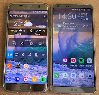
Comparing screen estate

The G8S' gigantic notch eats up much of the larger display, whereas I find the S10's punchhole camera less intrusive. Especially when zooming YouTube content to 16:9, the difference is noticable.

Punchhole vs. mega-notch

Comparing the quality, the LG display is some years behind the Samsung AmOLED. The G8S' display is very good and I could easily live with it. But Samsung is the expert for smartphone OLED display and that shows. Images and movies have more depth and brilliance on the Samsung. Think of it like the difference between glare and anti-reflective laptop screens. The difference is about the same, just that both reflect about the same.

Rating - G8S: 8 - S10 Edge: 10

Audio

The audio section was, where the LG G-series (as well as the V-series) has been dominant over all other smartphones. So I was disappointed, that with the G8S, which should be a ramp up model from the G8, LG changed things to the worse.
First, this is the first LG G-Series model, that does not have the excellent Quad Audio DAC for the headphone jack. That does not mean, that headphone audio is bad on the G8S, but it is also good on the S10. I could not hear any significant difference on my Sony WH-1000XM3 headphones. At least, both phones still do have an audio jack.
On Bluetooth they both support the same codecs, so no difference here.
Leaving it to the speaker, and here the G8S is weaker than expected. After the G7 had that innovative Boom Box sound, though the G8S has a larger body, it sounds tinny compared to the S10. I tried all EQ settings and the Dolby mode on the  LG. They all sounded different, but all sounded tinny.
So after LG easily winning the audio section for years, with a draw in headphone and Bluetooth audio and a win in speaker sound, for the first time the Samsung wins the audio section. Hey LG: the boom sound speakers and the Quad DAC already have been engineered by you. Putting both into the G8S would have made it a clear winner again. But with the G8S beeing weaker in both headphone jack and speaker performance then it's own predecessor, this was an easy win for Samsung.

Rating - G8S: 6 - S10: 8

Camera(s)
This was a close one. Both companies use differect color science. Samsung is more on the warm side, LG is a bit cooler. It is a little like Fuji vs. Canon. I personally prefer the cooler Fujifilm look, but this is a matter of taste. Overall, there is no clear winner here. I took hundreds of shot with both phones, you can find some of them in this album. Often, I took the same shot in all three modes. Sometimes I tried to fix a shot in post, eg. by lowering saturation. You can identify these by an underscore and a counter at the end.
Often, one shot went completely bad on one phone whereas the other gave a good picture. And just the next shot, is has been vice versa. For the most times, forget about the intelligent auto modes. They do too much on both phones, giving the shots a complete unrealistic look. But shooting in manual is often also a bad idea.
You cannot trick physics and the small sensors in both cameras have very limited dynamic range. Like cheap cameras 20 yrs before. So get a somewhat realistic image, they need to do at least some HDR. Unfortunately, that is what they don't offer. You can only choose between no HDR (manual mode) or HDR with many picture 'optimizations'. So in many cases, my old S7 Edge delivered me the best shot, just because it made more subtle 'optimizations'.
The warmer Samsung and colder LG color science lead to more yellow'ish greens on the S10 and blue'ish greens on the G8S. The natural look would often be somewhere in the middle. The G8S sometimes also mixes some red into the sky, giving it a slightly pink'ish look. Especially the latter is harder to fix in post.
Same picture, different color science: G8S (left) vs S10 (rigth)

The one big advantage the S10 has is it's variable aperture on the main camera. While the G8S has a fixed aperture of f/1.8, the S10 can change between f/1.5 and f/2.4. So in good lightning, the S10 can step down the aperture and trade the amount of light for a larger depth of field. This results in overall better sharpness of the S10 when pixel peeping. The G8S images are overall a bit soft, sometimes also visible in full image viewing.
Also this helps with sunlight from the side, where the G8S camera sometimes produced heavy reflections, whereas the S10 steps down and delivers a clear image. System camera shooters know, why they carry a lens hood. It helps a bit, when you try to use your hand to give a bit of shadow to your lens. But it makes shooting a bit fiddly and sometimes I got my fingers into the pictures.


Short distance: sometime focus problems on the G8S, but better color

The S10 also has a multi exposure night mode, the G8S' night mode is more a traditional one. If it does not get too dark, the G8S often delivers more realistic images. But when it gets darker, the S10 takes the lead here. 


Night modes: subtle and realistic vs. night vision

LG has often been blamed for it's mediocre selfie shooters. I personally prefer the results from the G8S, as they are less 'optimized'. But both are better than my old S7 Edge, where everyone had a wax skin on photo. But in low light, the S10 is by far the better selfie shooter.
When shooting manual, the S10 often exposed to the right (ETTR), which is a good starting point for a manual mode. The G8S tends to more often blow out the highlights. But as this is a manual mode , you are to set your exposure manual anyways. 
After all, I went through all photos I shot with both phones and rated, which I did like best. Overall, I preferred the G8S' photos slightly more often, than the ones from the S10, but that was close. Mostly, I liked that the G8S' photos often looked a bit more natural then the ones from the S10. And I also prefer the cooler look, but as I said, I am more a Fujifilm than a Canon guy.
I cannot say much about video, as did not shoot many videos during this test. Both results looked very similar to me, the S10 has a better working stabilization.
And to give you a long term review: after this test, I took the S10 on a holiday and found that it has been a very reliable shooter. Overall, it was much better, than I expected. Beaches with blue skies, dramatic sundowns, city trips in bad weather: the S10 handled most situations well so I could often leave my larger camera at home.
Overall the S10 has better sharpness, a better night mode and a more reliable auto focus. The G8S has a color science that I personally prefer and sometimes the images look more natural. Overall I could get happy with both and declare a draw.

Rating - G6: 8 - S7 Edge: 8

Summary
This time, it is a clearer win by points for Samsung. And the points reflect, what my overall experience with both phones has been. I used both for nearly three weeks as my daily driver. Using a phone every day brings out so much more than just running a test suite. And overall the S10 is a more balanced phone than the G8S. The S10 is a bit like a higher end Volkswagen: not the world best in every aspect, but very good in most and bad in none (well ... except for some Diesel models, but that is a different story). The G8S is very good in some aspects like the camera and the price. But the battery runtime was a bit unpredictable and for me it was a bit too bulky without delivering value for that bulk. Tinny speakers, weaker battery, only minimal more screen estate: these are no good reasons for carrying a bulkier an heavier phone. All the features from the IR-Array are gimicky and mostly useless. LG went the wrong way here. They should have saved the money for the development and the extra components. Instead they should have just build in, what they already had developed: the Quad-DAC and the Boom Sound speakers. And the time they had spend to deliver the software for that IR features could better have been spent for Android software upgrades. And the gigantic notch could have be a very small one with just the front facing camera.
If LG would have taken the easy way as I described, it would had a draw on software, a smaller gap in the display section, a win in the audio section. That would have been 8 points more for the LG, what would mean a win by the points. But LG decided to invest in the wrong area.
That does not mean, that the G8S is a bad phone. Especially in it's actual price range, it is well positioned against it's competition. But it could have been so much more and it is a shame that the always innovative G-Series ends with a model, that is less competitive compared to it's predecessors.
Talking about the winner: the S10 is now my daily driver for two months and I really like it. It is my best phone so far. If I had three wishes on the S10, I would wish for the return of the fingerprint scanner on the back, a better fingerprint scanner on the front (like many Chinese phones already have) and a more muted and realistic color science for the camera. But as the S20 is already out, I know that at least my dreams for the fingerprint scanner won't come true in that generation.
But the S10 is an overall very strong performer with a very good camera, superb battery life, a handy form factor, an excellent display and very good software support.

Overall Rating - G8S: 45 - S10: 51

Sonntag, 25. November 2018

How to fade in / fade out title text in Shotcut

There are some guides on the internet on how to fade in/out titles in Shotcut. But I did not find any, that describes the following way, which is the easiest.


I am starting with a new project here, but of course this also works with an existing project


Add two video tracks, one for the titles and one for the videos.


Select the track where you want the titles to be in.


Now here comes the trick. Select 'Open Other' and select 'Color'


Just leave the color to the default, which is 'transparent', and click 'OK'.


In return, you will get a clip with no color. Drag & drop that black square to your timeline.


Trim it to the desired length.


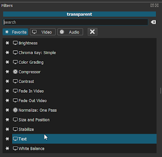
Add the 'Text' filter to that clip.


Arrange it to your like.


Add a 'Fade In Video' filter to that track.


Adjust the duration to your like and do not forget to check the 'Adjust opacity instead of fade with black' box.


Do the same with the 'Fade Out Video' filter. Now you timeline should look similar to that.


Until now, this might look a little lengthy. But it can be done in less than a minute. But if you do not want to do this over and over again, just save the project as your personal template.


Now just drop any clip into the 2nd video track and watch your title fade in and out.

Sonntag, 15. Juli 2018

Galaxy S7 Edge vs. LG G6 ThinQ: still flagships in 2018

Intro

I have been a Samsung Smartphone (and only Smartphones) user for many years. Starting with the first Galaxy S, I got addicted to AMOLED displays. Then I had the S2, S3, S4, S5neo and S7, skipping only the S6. With no expandable storage and no user changeable battery at the S6, the S5neo became my daily driver for two years. I am no Samsung fanboy and always search for a better alternative from other vendors. But in the end, Samsung always had the best overall package for me. Getting the latest Galaxy S in general means getting the best screen, best camera and leading edge performance. And even the Galaxy S series is not always leading in every aspect, they also don't fail in any. And I am one of the few, who like TouchWiz, now Galaxy Experience. Though I immediately disable most features, there are always some which I like and miss when using a non Samsung phone. But I always also lean towards LG smartphones. They always try to make things better then the other vendors and always came up with features I really like.
In 2018 I had a hard choice between the Galaxy S7 and the LG G5. The G5 still had a user replaceable battery, a great dual camera and superior audio quality with AptX HD. But the screen was only average regarding colors and brightness, though it had perfect sharpness. In the end, I sticked with what I know and got the S7, but that was very subjective choice. The G5 is overall an awesome phone, that deserved far more attention than it got. My son for example preferred the G5 and it became his daily driver (until ... see below).
But coming into age, this summer holiday where my smartphone has been my only computer I took with me, I had the desire for a larger screen for better readability. The actual models S9 and G7 ThinQ are still to pricey for what I am willing to pay.
I always recommend to go for last years top models, when buying a new smarthone unless money is not important to you. The still excellent S7 Edge and G6 ThinQ are now in the bargain range. If you are looking for a smartphone delivering 90% of the new flagships for 30% of the price, these two are excellent choices.

Overview
The LG G6 comes in different versions for Asia, Europe and the US. Don't buy the European version, that is the worst deal of the three. The US-Version at least supports Qi wireless charging. The Asian doesn't support that, but gives you 64 instead of 32 GB of storage, dual Sim capability and LG's unique quad audio DAC. I took the Asian version, though I miss Qi charging.
LG got a lot of bashing for slowly updating the Android OS. But now, both phones are on Android 8.0 Nougat with Patchlevel July 1st.
The S7 is 2016's flagship from Samsung and in general a S7 with a larger, rounded screen.

Body and build
Both vendors took different, innovative approaches to deliver a larger screen without making the device too bulky in the hand. LG was the first to move to a new aspect ratio, which is 18:9 (or 2:1). LG already had the power button / fingerprint reader on the back for some generations and that is also one of the best features of the LG G6. That approach saves space on the front panes, so LG could trim down the bezels, giving a great screen-to-body ratio. In combination with the screen aspect ratio, this resulted in a phone that is astonishingly easy to hold in the hand. It feels like a phone of the normal S7 size, though it is a millimeter or two wider. Also, according to LG the G6 passed 14 different military standard tests. Though I haven't tested that, the G6 gives a very solid feel in the hand and some tests von YouTube demonstrate it's great durability.
The S7 Edges approach to a hand compatible large screen device is to curve the edges of the screen, leaving no bezels left and right. That brings a 5.5'' 16:9 display onto a phone, that is not really wider than the LG G6. The other reason why Samsung did this is probably because they can. But having a screen on both sides with no bezel has an impact on durabilty. The S7 Edge is more durable than you might think. For example, view the After the Buzz video from Pocketnow.com. But you will probably put your phone into a stronger protective case, than the G6, where I feel comfortable with a standard EUR 5,00 case from eBay. For the S7Edge, I have chosen a Spigen Neo Hybrid Crystal which gave me a good feeling, but adds bulk and is a little sharp edge. But this leads to another problem with the Edge Display. As the case has to fit around the edges of the screen where the screen already bends, it leaves a gap between the screen and the case, making it harder to use the edges of the screen where the scrollbar lives.
Just from the looks, the S7 Edge is a gorgeous device, whereas the G6 is OK, but more bread and butter. Additional, the front of the silver G6 is like a mirror which could be a little distracting.
The fingerprint reader of the S7 Edge is under the home screen just as in former models, which is always a little stretch and heavy usage sometimes make my thunb hurt. The G6 has the fingerprint sensor on the back, just where my index finger lands when I take the G6 into my hand. After using the G6, I could not think about any other position of where a fingerprint sensor should be. When switching back and forth between the devices, I often put my finger on the S7 to where the sensor on the G6 is. Additional, the G6 sensor is fast and reliable whereas the S7 Edges sensor sometimes requires an extra try or two, especially as the thumb after the stretch touches the sensor from the side. The G6 sensor immediately brings you to the home screen, on the S7 Edge it is a two step process. First press the home button to activate the device and get to the lock screen, then leave your finger on the sensor to unlock. At least, the S7 Edge is easier to unlock with the finger, when the device lays on your desk. But you can wake up the G6 by double tapping on the home screen.
The S7 Edge is more uncomfortable to hold and to operate. The G6 should have a better durability, is comfortable to hold, I could not think about a fingerprint sensor could be any better.
Overall, the Body and Build section is won hands down by the G6.

Rating - G6: 10 - S7 Edge: 6

Displays

The G6 comes with a modern 18:9 (or 2:1) display, whereas the S7e comes in a traditional 16:9 format. Which format better suits your needs depends on your use cases. 18:9 seems become the new standard and LG has been an early adopter. The format sits in the middle of traditional PC and TV content and 21:9 cinema content. So that should be the sweet spot. If you are watching many movies on your smartphone, 18:9 should be a better choice. But for 16:9 content, you won't get more content on the G6 than on a 16:9 5.1'' Galaxy S7. The YouTube app now allows zooming for 18:9 displays. But that means cutting the top and bottom rows of the content to fit the 18:9 screen. Depending on the content, this could fit very well or it could mean to cut a head. If you mostly watch YouTube and TV content, you will get a significant larger display area on the S7e.


Display comparision: the G7 Edge is better for 16:9, the G6 is better for 18:9 content

Also, as the S7 Edge has hardware buttons, you can always use the whole screen for content. When showing the button bar on the G6, the remainig space on the display is smaller than on the S7 Edge. So the G6 only has an advantage on 18:9 or wider content, and only if the on-screen buttons are disabled. And that means to operate the buttons, a swipe up is required to display the button bar.


Though the G6 has a taller display, when showing the button bar the G6 has a narrower display

Both phones offer an always on display. But the G6's is so dark, that you can leave it switched off.
The G6's display is certified for Dolby Vision HDR content whereas the S7 Edge's doesn't. But this is a complete no contest. The Samsung AMOLED display offers so much more dynamic Range, so much more details in dark areas, so much more saturation and contrast, that these are not even in the same league. The G6's display is not really a bad one, about average for a higher end LCD and if you have never used an AMOLED display, you maybe won't care. But in a direct comparison these are worlds apart.
In direct sunlight, it is a draw. The Samsung display is getting red'ish making it harder to read, but a tad brighter. Overall, both can be used even in brightest sunlight, but you won't watch a movie or play a game in that lightning situation.
For some photos comparing both screen see this album.

Rating - G6: 5 - S7 Edge: 10

Audio

When I compared the LG G5 to the Galaxy S7, the G5 won the Bluetooth audio section by a wide margin because the G5 supported AptX-HD wherea the S7 running Nougat did not offer any HD audio option. Now with both devices on Oreo, both support AptX and Sony's LDAC, which is the best option of all if your headphone supports it. And of course, if you root your phone, you can install missing CoDec's anyways. But out-of-the-box, the G6 has a slight edge if you have a headphone that only supports AptX-HD, but not LDAC.
Overall, on my Sony WI-1000X, which supports both, AptX-HD and LDAC, both phones sound the same, while the G5 won by a wide margin over the S7. So Samsung has closed the gap. For the cable headphone test, I used my Marshall Mode EQ, which sounds good, but are no high-end headphones by any means. I don't own any high quality headphones, so I have to rely on the judgement of others. But mostly all testers praised the quality of LG's quad DAC audio output, so the G6 definitely has an edge here. According to them, no other smartphone can match those from LG, that come with that quad DAC.
For the built in speaker, both only have a bottom firing single speaker, which both sound OK, but are no match for phones with dual front-facing speakers. For my ears, the G6 sounds a tad better, but this is very subjective. But where the G6 scores a big point is, when you hold your phone in landscape mode and accidentally block the speaker with a finger. The S7 Edge hardly gives any sound, when the speaker is practically off. The G6 in contrast gets only slightly less loud and a little bit duller, but still very good. And it sounds even better to my ears when laying on a table. Maybe this is already an early version of the Boom Sound feature of G7. If the G6 had double front firing speakers, it would be king of the will with 10 points.

Rating - G6: 9 - S7 Edge: 6

Battery
In my simple test, I just run a YouTube video in an endless loop on maximum brightness. When the batteries went down, both phone tried to save some energy by lowering screen brightness, but I switched both back to maximum. The G6 delivered 5 hours of screen on time, the S7 Edge ran one hour longer and made it to 7 hours screen on time which is very good. On a normal day, I have about 30-40% battery left on the S7 Edge and even on heavy usage, I always had more than 10% left when I went to bed. With a little power saving, I could easily make it through 2 days. 
Please Note, that I root all my phones, disable or delete everything I don't want and install a firewall that blocks everything except what I really use. That helped a lot with older with older Android versions, but now with Nougat and Oreo, the effect is less noticeable than back in the days with Android 4.x.
The G6 should bring you through the day, but on heavy usage you might want to charge a bit in the evening. But please note, that after about 12-15 months of usage, depending on your charging behaviour, the battery will lose about 30% of its capacity. So while the S7 Edge should still bring you trough the day, the G6 might need some extra charging on most days.
The G6 already has USB 3.0C and QuickCharge 3.0 compared to Micro USB and QuickCharge 2.0. So the S7 Edge runs longer on battery, but the G6 charges faster. After my screen on test, the G6 took 1:43 hrs to fully get charge up. The S7 Edge needed 1:58, and it additionally supports Qi wireless charging, which the European or Asian versions of the G6 don't offer. Only the US modell of the G6 suports Qi wireless charging, but these don't have Dual-Sim, Quad-DAC and only 32 GB of storage.
Overall, the energy sections goes to the S7 Edge.

Rating - G6: 5 - S7 Edge: 8

Camera(s)
The G6 has a clear advantage over the S7 Edge with it's wide angle camera, which really helps if you cannot step back to catch a wider view for your shot. Comparing the main cameras, there is no clear Winner.


Same picture, different color science: G6 (left) vs S7 Edge (rigth)

It seems that the G6 has a larger minimal focus distance, so if macro shots are important to you, the S7 Edge might be a better choice. Overall, both have a different color science. The S7 Edge often produces warmer color tones, a little too warm for my choice. The G6 often pushes contrast a little too much and skies tend to get a red'ish tone. It is a little like Canon vs. Olympus, if you know mirrorless cameras. And it is important to mention, that the too warm color tint of the S7 Edge can be easily corrected with the imaging software of your choice. Normally I batch correct all S7 Edge photos in XNViewMP slightly to a cooler tone which works well without any noticeable loss in image quality. But the boosted contrast of many G6 images cannot be corrected afterwards, because that is a destructive manipulation.
The G6 has some kind of night mode, that really delivers better photos in night scenes, both in color and overall brightness.


In my album with test photos, I do not see a clear winner. Sometimes I prefer the image from one phone, sometimes that from the other and sometimes it is a draw. For me, I prefer the G6 images a little more often than the ones from the S7 Edge, but this is a close choice. And if I do a color temperature correction on the Samsung Images, it would be a draw.
So the G6 has the extra wide angle camera and a useful night mode, but delivers often too much contrast which spoils the photos. The S7 Edge has a lower minimum focus distance and often delivers sharper images. The color temperature is often unrealistically high, but this can be fixed in post.
Overall I prefer to use the S7 Edge for photos because overall I found the results a bit more reliable, though I miss the wide angle. But this is only because I am willing to fix some weird color science in post. If you want just take the photos, the G6 migth be a better choice.
For selfie lovers, both aren't a perfect choice. Samsung does too much face retouching, giving you some kind of plastic look. If you optimize your skin in your selfies, this might be your choice. But if you want a realistic look keep in mind that this cannot be disabled. At least you can install a different camera app, that does no automatic skin retouching. The G6 does not do that, but the image quality of it's front facing camera is lower.

Rating - G6: 8 - S7 Edge: 8

Summary
There has been no clear winner, both phones have their pro's and con's. From my scoring, it is a very close 37:38 with the S7 Edge leading with just one point. After all, I kept the S7 Edge as my daily driver, though I miss the wide angle camera, the better fingerprint sensor of the G6 and I still dislike the Edge display. But overall, I love OLED displays, especially the absolute black if I use it at night. But if you don't mind an illuminated dark grey instead of black, the G6 might be the better choice. If the G6 had an OLED display, I would have taken that one instead of the S7 Edge.
My son took the G6 and is very happy with it. He said, it is the best phone he ever had.
One thing, LG really drives me nuts with is their market strategy. They seem to have excellent engineers and idiots in marketing. The G6 could be a nearly perfect phone. But then, LG's market modell managers decide, that European buyers don't want wireless charging. The room for the charging coil is still there and they put a plastic dummy into it. And European buyers only get 32 GB of internal storage and no dual SIM slot. And US buyers get the wireless charging, but not the quad DAC if I get this right. Hello, LG! Just build one model that has all the features so buyers don't have to get one from the other side of the world if they want a better feature set.
For the last years, LG phones were always on my shortlist and I have been close to choosing them as my daily driver. LG's engineers created great stuff  that I loved year over year. The leather back on the G3, the wide angle camera on the G5, the Quad DAC, the best audio output in the industry. But LG always managed it to do some unnecessary stupid so in the end I choose the Samsung model instead. So for this year, it is again the Samsung for me.

Rating - G6: 37 - S7 Edge: 38

Sonntag, 29. April 2018

Samsung Galaxy S7 vs. LG G5 quick camera comparison

This is just a short one, because I made my decision for the S7 by the excellent SuperAMOLED screen and both cameras are good enough for what I need. Comparing the Cameras, here is the obvious. The dual cameras makes the G5 much more usefull. The wide angle lens catches about the same field of view as the human eye, which is a big plus. The narrower lens gives a slight telephoto angle. In between is the single lens of the S7, which is 4/3 compared to the 16/9 of the G5. Personally I would prefer the DSLR-like format 3/2, which is a good compromise but none of the two offers.
The autofocus of the S7 is more reliable, I dropped a few shots from the G5 because of AF misses.
Comparing the images, the G5's images look much punchier, the S7's a little dull. The S7's images need a bit more punch like the one I gave a slight edit in Darktable. For later editing the S7's approach is more usable, because the high contrast of the G5's images leads to some loss of highlights and depths. The S7 seems to try to Expose-to-the-right (ETTR) to save highlights, wheras the G5 has a few blown out highlights as in the white sections of the roof on picture 3.
Interestingly, when looking on the photos on the smartphones screens, the G5 images look dull and the S7 images are punchy. So maybe both manufacturers try to comensate the properties of the specific screen.


Picture 1: The G5's shot is out of focus, though this is a best of three


Picture 2: More punch on the G5, more sharpness on the S7


Picture 3: More punch on the G5, especially more saturated green. But also blown out highlights on the white part of the roof on the G5. The S7's image is slightly dull.


In comparison a wide angle shot of the G5, which matches about the angle of the human eye, but with visible distortion at the hut on the left.


On picture 4 again more punch from the G5, but the shadows got too dark with loss of detail. The S7's shot is too dull. The optimal look would be somewhere in the middle. The G5's image looks overprocessed, especially way too much microcontrast/clarity. In contrast, the S7's image could use some more processing.


With some editing in Darktable, I adjusted the S7's image to my taste,V adding some elvia, local contrast and vibrance.

Both smartphones are good casual shooters, but for both the results need some touching. As an alternative, RAW might be an option.